When Henry Phipps established his family office a century ago, he kept his name off the door, choosing instead to honor the scientist Henry Bessemer who invented the technology that he and Andrew Carnegie had commercialized. Ever since,
Bessemer has followed a tradition of quiet privacy, settling in the shadows of our entrepreneurial partners. We’ve had no PR agent. No splashy sponsorships. No publication of our results. (And no promotions for our blogs.)
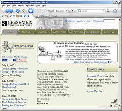 But for those entrepreneurs who consider sharing their dreams with us, we need to share our story with them. As early as 1998 we published a web site celebrating our entrepreneurs’ successes (and lamenting our failures) in a graphical motif that evoked our turn-of-the-19th-century roots. Since then, BVP.com incrementally sprawled, as web sites do, into an aging maze of unmarked avenues and back alleyways. Pre-occupied with our portfolio companies’ online presence, we neglected to renovate our own internet lobby.
But recently we crossed the point where we invest more venture capital internationally than we do domestically. Engaging new communities of entrepreneurs curious about our practice, we asked our IT Director Fred Shilmover to streamline our web site with 21st century technology and a Googlish respect for the web user.
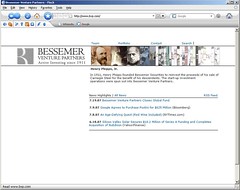
Our design objective was to tell our story without getting in the way of what a visitor wants to find. Even with 6 offices around the world, 100+ IPOs under our belt, and 96 years of history, we strived, above all, for clear, simple navigation.
With help from web designer Twig Gallemore, we crafted a tight site map around three simple menu options (TEAM / PORTFOLIO / CONTACTS) and filtered portfolio search options, to deliver quick answers. But to satisfy the entrepreneur who wishes to stroll around and browse, we also incorporated sliding photo albums in the header, as an alternative navigator through our history, team and offices. (Technical kudos to Flash god Erik van der Neut.)
There are clear tradeoffs to building our site around a Flash element. We have critical performance issues to resolve, browser support varies (it’s best viewed in
Flock!), much of our content lies hidden from search engines, and we still need to redirect many links.
But I think that the newly launched
www.BVP.com achieves our design goals. Do you agree? Is it what you’d want to see from your venture capital partner?
Blogged with Flock
I find the look and feel of your new website, personally, quite comforting. I'm not looking for venture capital partners this year. But I think those company founders who are on the hunt for venture capital SHOULD be attracted to your approach.
ReplyDeleteTo paint the picture of the challenge, briefly: I think the high-tech venture capital wheeler-dealer who drives up to the Santa Clara IHOP in his $180,000 Lamborghini wearing a $3,000 Armani suit, and expects that his open collar makes him "one of the boys" is presenting a confusing, mixed message. If you are a Lamborghini-Armani kind of guy, don't hide the $50 necktie in the glove compartment at the last minute.
If you're a blue jeans and t-shirt, back-end-of-the-lab kind of a guy, don't rent a suit for the meeting UNLESS SOMEBODY WITH MONEY ASKS YOU TO. But if you wanted to blow $50 on a nicely tailored cotton dress shirt, I wouldn't be offended.
Be yourself, whatever that is. Gentlemen, you seem to have done this. Congratulations.
-- REG CROWDER
London, England and Brittany, France
http://www.MediaBistro.com/RegCrowdr
The portfolio view falls apart due to slow load and tracking issues. There is just too much information for this design to work very well.
ReplyDeleteFocus + context is the academic notion: what you are focussed on is clearly visible but the distant stuff is less so. In the portfolio view, the only information conveyed by the collapsed images around the focus is the portfolio's relative size. A tree structure by category would be more navigable but would break consistency. Trees can be distorted in similar ways to convey density of subtrees.
The site is pretty confusing. The problem with all mouse over links is that it never really works very well. For e.g. when I mouse over the contact link, I sometimes get the photos of people.
ReplyDeleteIts a bit too fancy for me.
The old BVP site, in my opinion, was the best VC site that I had seen. It really had an old world charm that the new site somehow misses. It looks like every other VC/PE/Law firm site.
Sorry, for the harsh feedback. I just really liked the old site.
Overall I liked the concept and the layout worked beautifully for most of the site.
ReplyDeleteThe portfolio section is just too massive to display neatly. There are too many pictures in the array to effectively navigate to one of interest. Just moving your mouse a little jumps over several companies. Loading in this section also takes way too much time. Even if I choose a company using the list of names, it takes a little while to display the info. I suspect this is due to the page's images.
Didn't think of clicking on a team member picture (since my cursor was a arrow instead of a hand like most images you can click on), but was pleasantly surprised when I did. This page loaded and responded quite nicely as with the contacts page.
From a person who has viewed over 250 PE/VC websites in the last month, I found the navigation to be quite easy and useful (except for the portfolio page). The pages also weren't "too techy" in that it used a common theme throughout and I didn't have to sit and wait on splash screens and other flashy time wasters. On that note, it might be more useful to separate the portfolio into sectors and possibly current/inactive. This would help with the size of the slide show and possibly speed things up, as well as give users an idea as to your current investment interests/focus while allowing us browsers to see the older investments as well.
I do like the top 50 and anti's & timeline type show on the home page.
yikes! that's a lot of images to load. the sliding photo albums is too slow to be of much use. old site was better.
ReplyDeleteRoddy